The evolution of the vpointzero identity, from connection to the final result.
The first ever conception of a persona identity as a designer, created around 2019. The idea was inspired by an album I was listening to at the time called 'アンドロメダ' or Andromeda by t e l e p a t h テレパシー能力者. The central idea was to create something spiritual, ethereal and liminal.
The idea of a free design project arose around the same time in 2019, which would allow people to get free design work while promoting myself as a designer and getting real world design experience. This idea was on the backburner for a long while until it's final conception.
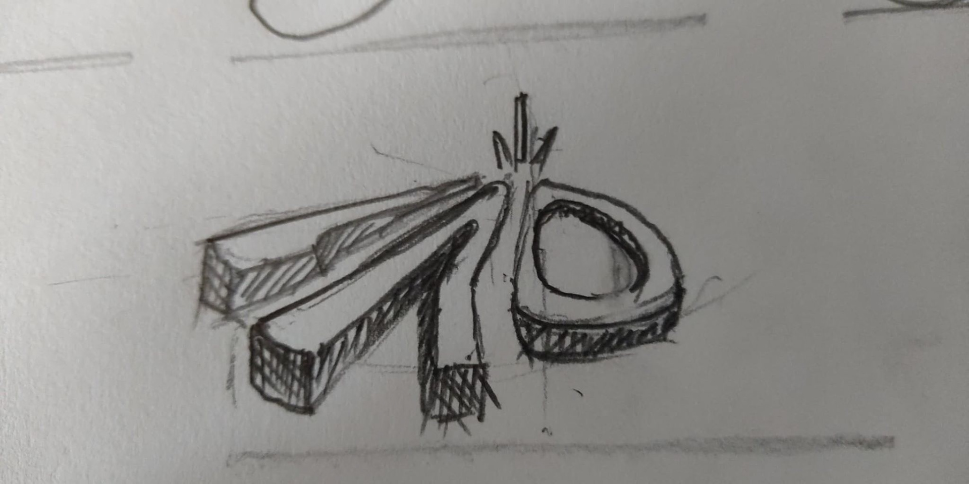
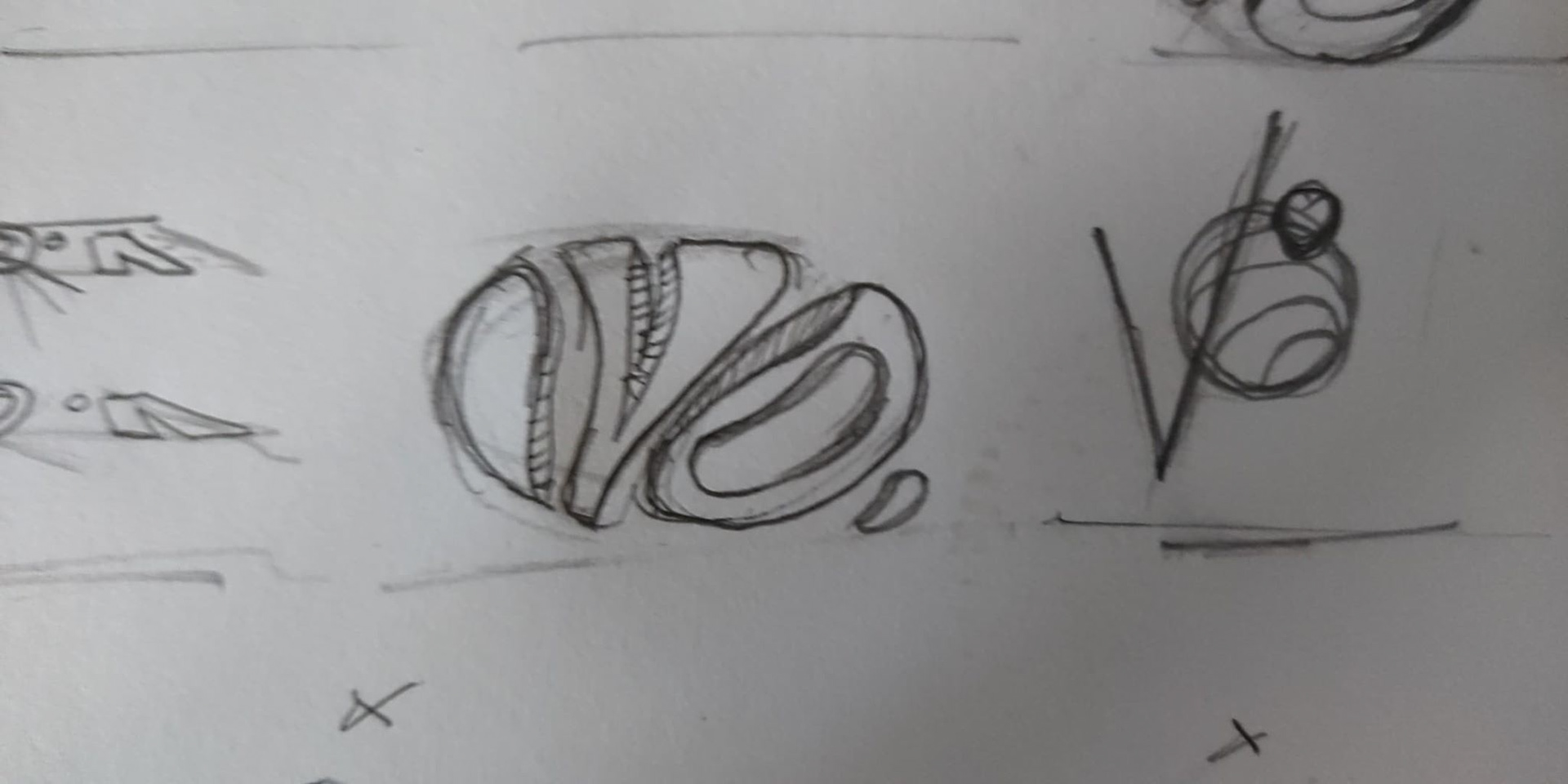
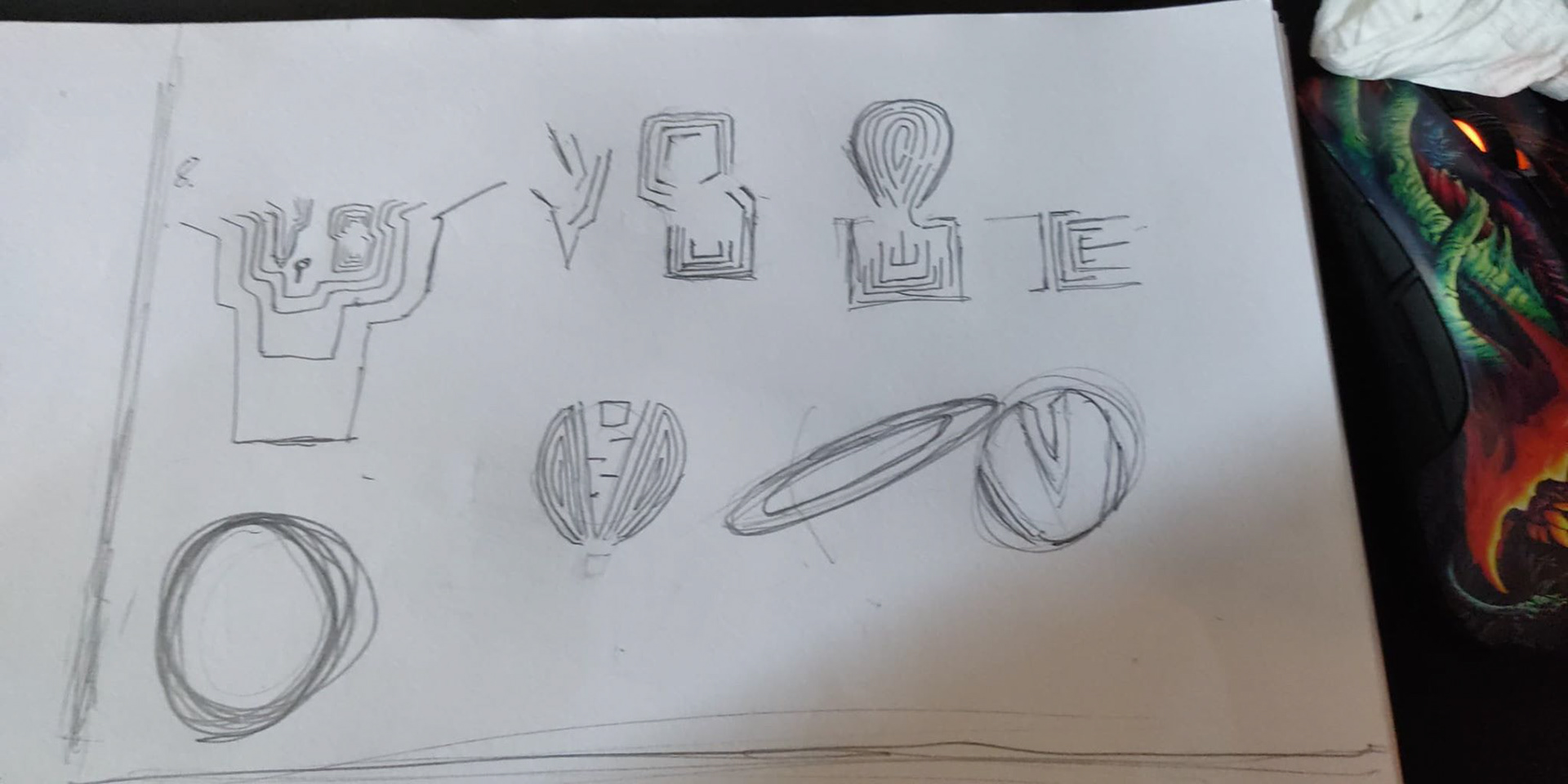
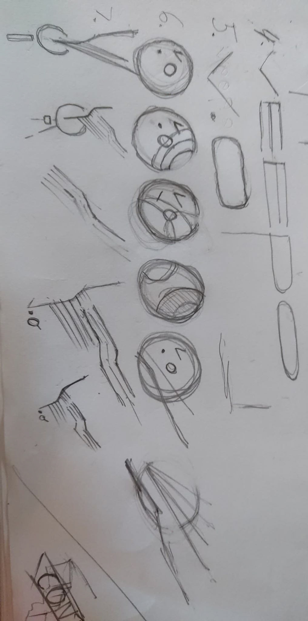
I created about 20 to 40 sketches, trying various concepts and playing with forms I felt were right, and a theme of perspective and depth surpassed many of the shown concepts. The shadows and pop of 3D created something very interesting to look at, and it drew the eye more than an abstract form.
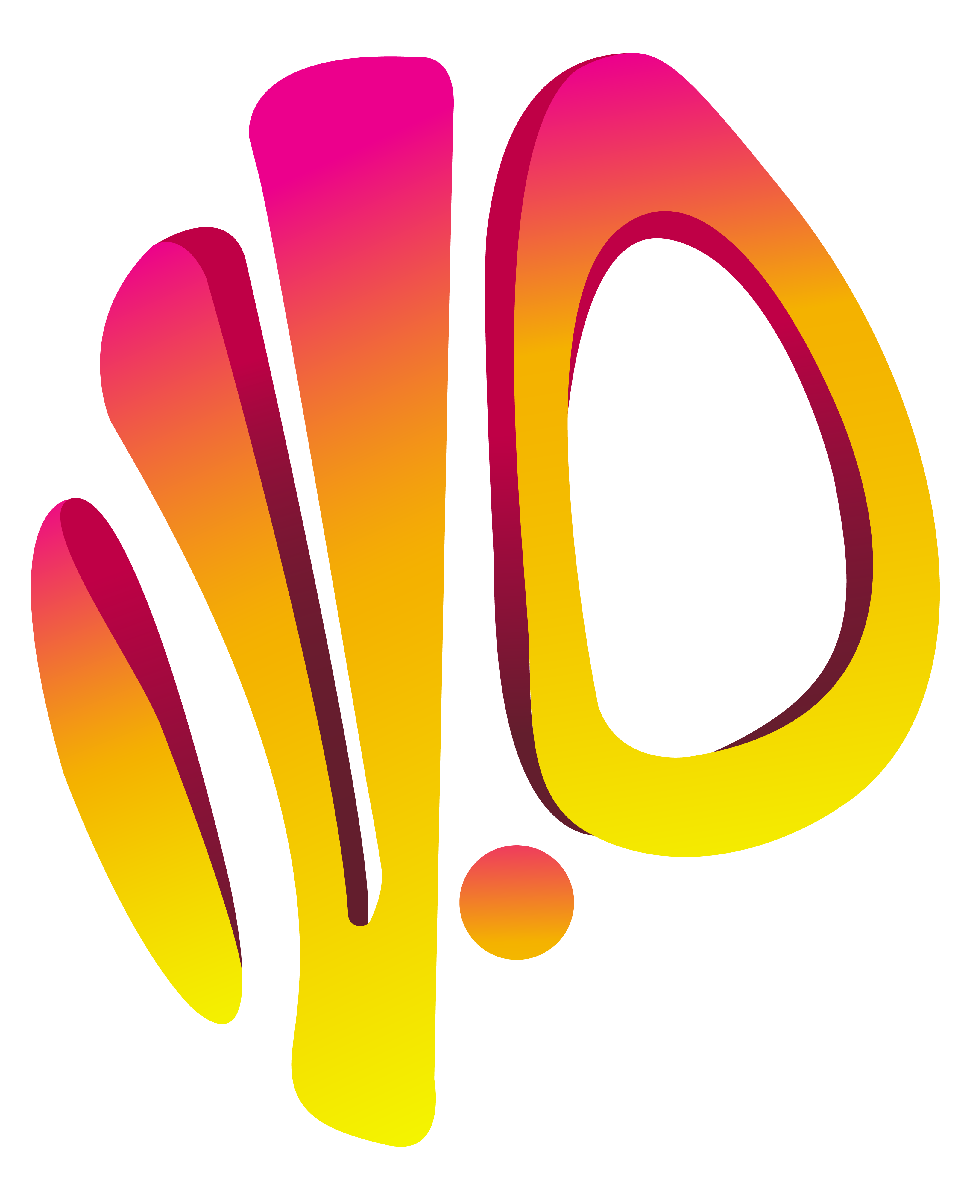
The final sketches created this result as an output. The name Veepo or vpointzero was chosen to at the beginning, and this form was the most appealing to me and others that gave me feedback. Furthermore, it encapsulates organic design, which I intended to create by thinking of initials, trapped in a sphere or egg, that had been cut or carved by a sharp knife, or an orange in a spiral cut by a fruit peeler. The form, and even the colour had it's roots in this idea.
This was the first replicated final image from the sketch. The forms would stay more or less similar, but it didn't sit right with me and some of the comments from my pairs. The legibility and form was under-developed. A final iteration would be required.
The logo was flipped to 90 degrees along an imaginary axis, and the vpointzero motif was born visually.
